


Project Type: Brand Identity
Programs Used: Illustrator, Photoshop
K.O Burrito is a fast food restaurant that specializes in Tex-Mex food with their most popular item being, The Burrito. This goal was to create an original restaurant along with having consistent branding across its physical items.
WHAT IS K.O. BURRITO?

RESEARCH AND DESIGN PROCESS
The goal with K.O Burrito was to find ways to make it stand out from other competitors in the space such as Chipotle, Moe’s, Qdoba, and other competitors.
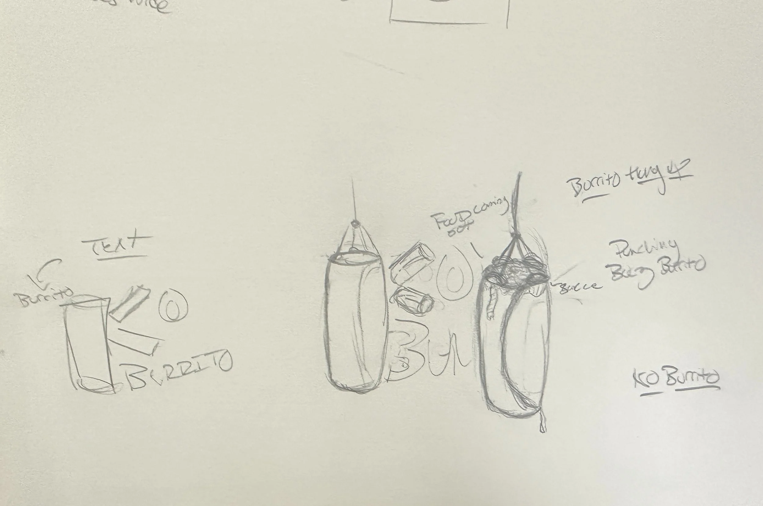
To have the brand stand out from its competitors in the market, the theming decided was to be boxing influenced with some pieces of boxing equipment included in the design. It turns out a punching bag and a burrito share the same shape.
I wanted boxing equipment to be incorporated into the design of the logo and there were a few iterations before I settled on the punching bag being the object of choice. It very much helped that both a punching bag and a rolled up burrito have a similar shape.

LOGO V1

LOGO V2

LOGO V3 (FINAL)
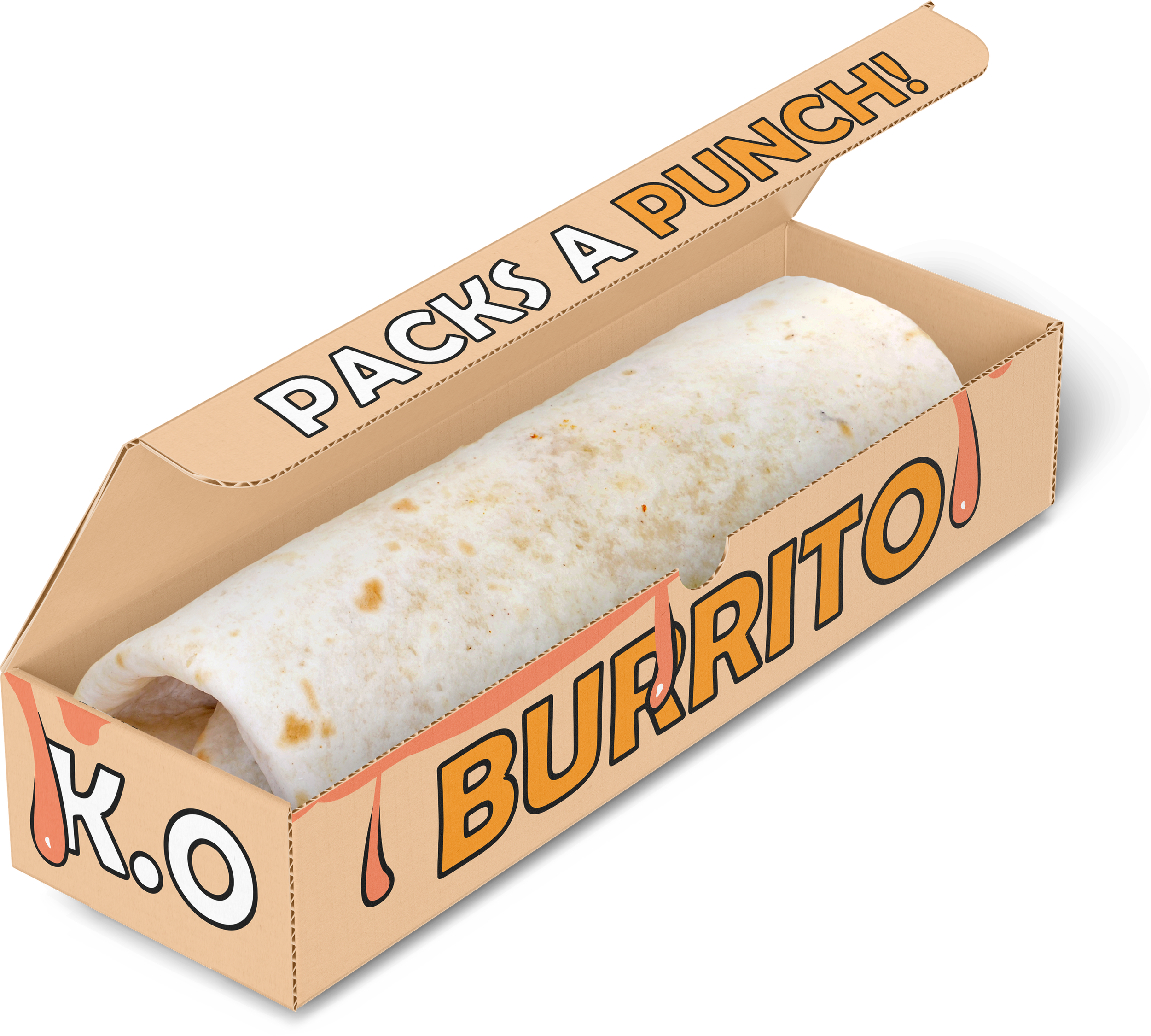
Benefits of Having a Box for the Burrito:
Ensures each burrito stays the same size
A lot more stable and appealing than leaving a burrito in aluminum foil
Opportunity to continue the branding and theming with unique packaging
FOOD PACKAGING
For the design of the boxes and the cups, I opted to give them the sauce drips from a burrito to further match the logo and keep the branding consistent.
