Project Type: Brand Identity
Programs Used: Illustrator, Photoshop
King of the Ville is an Esports tournament series for the Super Smash Bros. video game franchise that is hosted at Millersville University. It was initially created in 2017 during my time as President of my University’s Esports club and has become a staple event that is hosted every year. This redesign happened during for the 3rd event in the series in 2023 and was marketed as being the biggest one since its hiatus due to the Covid-19 Pandemic in 2020.
The goal of this redesign was to differentiate itself from the previous events in the series and be seen as a revival of the brand while having its own unique look from other competing events.
WHAT IS KING OF THE VILLE?
The initial logo concept for King of the Ville was to base it off of the cult classic TV series, “King of the Hill”. While this was initially a fun reference and people understood the call back, I wanted the event to stand on its own without relying on pop culture to be understood and accepted.
WHY REDESIGN?
PREVIOUS LOGO
NEW LOGO
Wanted the logo to look like a sticker
With the sticker appearance it can compliment a University theming with it potentially appearing on light posts, lockers, notebooks, and other areas around campus.
Kept the word arrangement and color theming intact from the previous logo
Expand on the royalty aspect of the name by including a crown and scepter on the logo
To continue theming, the royalty assets were used in other marketing pieces.
GOALS OF THE REDESIGN
CUSTOM FONT
For all pieces of advertisement I wanted any text on it to appear handwritten as if it came straight out of notebook to match the overall theme of the design. No publicly available font felt appropriate for the theme I was going for so I used my own custom font, ComicDans. This font is essentially my own handwriting and look identical to how I would write in a notebook so it felt appropriate to use.
When it came to the overall design of the posters and online marketing materials, I wanted to continue to lean into the idea of the materials looking like they belong on a college campus. This inspired me to have the main background be a cork-board that students would hang advertisements for their club events on in different spaces around campus.
MARKETING MATERIALS
INITIAL REVEAL BANNER
This overall format carried over into the rest of the marketing materials beyond the initial banner revealing the event. The main subject in the rest of the posts would be centered around a notable player that was competing at the event for the game they registered for, any notable deadlines leading up to the event, or if there was any special partnership that needed to be announced.
PLAYER SPOTLIGHT EXAMPLE
REG DEADLINE EXAMPLE
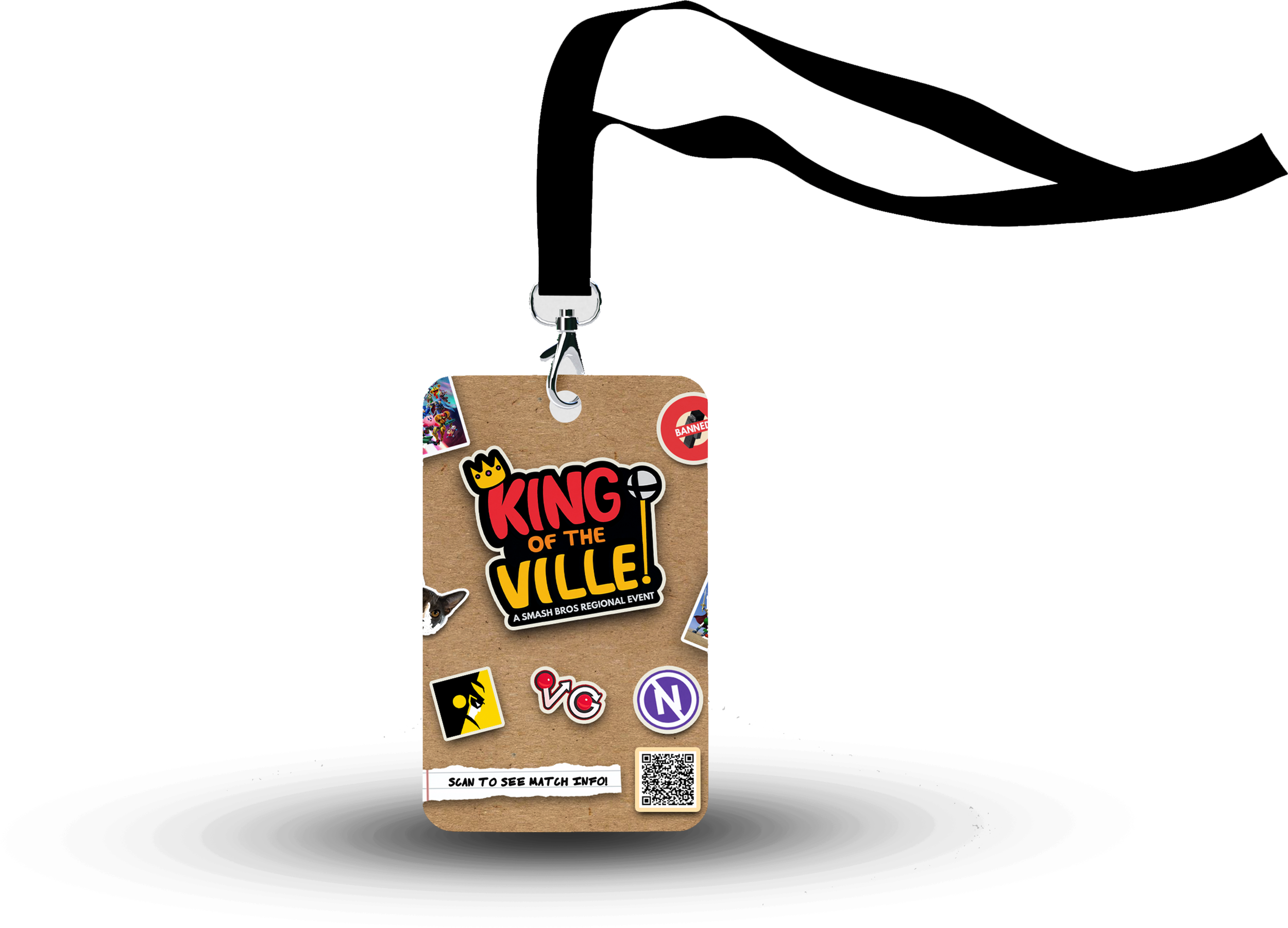
The main physical items for this event were in the form of event badges that attendees received upon payment at the door. These badges featured not only the event, date, and location, but also featured the partnered organizations on the back of the badge along with a QR code that took them to the event home page. There it reminded them of the schedule, rules, and any other additional information needed.
PHYSICAL ITEMS
All banners, player spotlights, registration reminders and any other event announcements were posted to both Facebook and X (Formerly Twitter). All images were designed with social media in mind and were kept in their original state.
All postings were made around 12-1PM every Monday, Wednesday, and Friday. During this time people are more likely on their phones during lunch while at work or school and it gave people something to look forward to or keep in mind when that time of day and week rolled around again.
SOCIAL MEDIA
With this posting schedule and 4+ months of advertising:
The event reached over 200 attendees from across the Northeastern United States; entrants as far as Maine and Virginia.
Was the largest attended collegiate Esports Event on the East Coast in 2023
Saw over 500,000 Social Media impressions across all platforms for this campaign


